

Covid-19: Cases, Tests and Deaths…January to July 2020

Having done a fascinating Influenza project at the dawn of the Covid-19 pandemic, I decided to tackle Covid-19 for the final project of my year long CareerFoundry course.
I had a wide range of data thanks to the meticulous data gathering by Worldometer which provided real-time updates daily on Covid-19 statistics. (1). Some of the variables Worldometer kept track of included total cases, deaths, recovered and tests for all of the countries in the world that provided data. This project only reflects data regarding Covid-19 from January until July of 2020.

I was already familiar with Worldometer, myself daily checking the Covid-19 statistics myself for the state I was living in (Connecticut). I also looked at the stats for the United States, and for the world as trend comparison.
I wanted to stay constantly updated on the different trends so that I could try to keep my family safe and isolated when things got really bad.
For this project, the statistics that really piqued my interest and awakened my curiosity involved the number of confirmed cases, the number of tests, and the number of deaths.
Since this data was divided by country, I thought that looking at the regional averages would be beneficial.
Fig. 1: Screenshot of the Worldometer page which kept accurate daily statistics on different aspects of Covid-19 including cases, deaths, and tests by country.My first hypothesis was that a higher test rate results in a higher case count and a lower death rate among those confirmed cases.
My theory was that more testing would lead to more awareness of the Covid-19 virus which would lead to earlier care for the patient along with the isolation of the patient to prevent further spread of infection into the public. Without testing, people would just keep getting sicker, infecting others and raising the probability of more deaths.
I decided to create a variable for comparing test rates between the countries. I divided all countries into which have lower, medium and higher test rates.
The table below implies that generally lower test rates correlate with lower case/death rates while higher test rates correlate with higher case/death rates.
On the surface, this appears to affirm my hypothesis when it comes to tests and cases, but it is the opposite of what I expected in terms of death rates.

Lower test rate countries only averaged a testing rate of 1% (only about 10,000 tests per million people). It also shows that just over 10% of tests resulted in a positive case (1115 total cases from around 10,000 tests) and that 3.2% of confirmed cases result in death.
Medium test rate countries averaged a testing rate of 5.5%, a positive case rate of 7%, and had 3.17% of confirmed cases result in death.
Higher test rate countries averaged a testing rate of 27.4%, a positive case rate of 2.6% and had 2.45% of confirmed cases result in death.
Fig 2: A look at the average deaths, cases, and tests per million people for countries with higher, lower and medium test rates.So what does all of this mean? My theory is that lower test rate countries had lots of unconfirmed cases and lots of deaths that were not specifically attributed to Covid-19. It was very difficult to determine how many people had Covid-19 when only 1% of the country was tested. Lower test rate countries also had the highest rate of confirmed cases resulting in death. When the testing rate increases to 27.4% (the higher test rate countries average), the positive case rate and death rate both shrank substantially as well.
My second hypothesis was that there was a regional correlation in the percentage of cases, tests and deaths that a country had. My theory was that a country like the United States would have similar percentages to Canada. I thought that comparing each region of the world to each other would be beneficial in seeing overall trends.

Fig. 3: A look at the average numbers of cases, deaths, and tests per one million people for each of the major regions of the world.Comparing the different regions by cases, deaths and tests per one million population found some interesting facts:
-The Middle East had an extremely high cases/1M population along with strong testing numbers and a relatively low death rate.
-The Americas had a high case rate, high death rate, and a medium test rate.
-Europe had the highest death and test rate, and a medium case rate.
-Africa, Southeast Asia and Western Pacific all had comparatively lower rates for all three variables.

Looking at the average number of deaths as it related to the average number of confirmed cases for countries in each region also revealed some fascinating facts.
Africa had the highest average percentage of confirmed cases resulting in death with 16.9%. One can see that the overall average deaths/confirmed cases number for Africa was actually quite low.
When looking at the below spatial map, many patches in Africa are missing data (along with Southeast Asia as well).
I believe that Europe had a very high deaths from confirmed cases rate (8.6%) because of the high population density and the high rate of elderly population which resulted in many more confirmed cases resulting in death.
Fig. 4: A look at the regions comparing the average number of confirmed cases and how many of these cases result in death.
Fig. 5: A spatial map showing the number of cases per one million population by the tone of the country's color, and number of deaths per one million population by the size of the red circle.The two regions that stand out the most are:
-The Americas (both North and South) and how high the case count/1M was for places like the United States, Brazil and Chile.
-Europe and how there was an astronomical % of deaths/1M for places like Italy, Spain and England.

In conclusion, it is disturbing to look at the statistics for the months of January to July of 2020 since the world was dealing with something so unprecedented.
As one can see with the arrow on the daily deaths chart to the right that the pandemic still had quite a ways to go.
Mask wearing was not as common as it soon would become, and the vaccine was still a long ways off.
Testing had just started exploding but only in certain parts of the world.
It would be interesting to see what happened to the statistics for the rest of the pandemic, wouldn’t it?
Fig. 6: Two charts from Worldometer that show from the beginning of the pandemic to now in terms of the daily cases and the daily deaths.To be continued…

References:
Kaggle.com with Worldometer’s Covid-19 Data for Jan. to July 2020 https://www.kaggle.com/imdevskp/corona-virus-report
Worldometer Covid-19 Counter https://www.worldometers.info/coronavirus/

World Air Pollution Deaths 1990-2017: Slow Progression Developing
“Looking at overall air pollution deaths per year, two countries average more than five times as many deaths as the closest countries. China and India both average over a million deaths due to air pollution per year.”
As I was exploring what to do for my next Udacity project, I felt like I wanted to do something regarding the environment. On kaggle.com, I came upon extensive data regarding world pollution deaths from 1990 to 2017.
I had a pretty good idea about the effects of outdoor air pollution, but was taken aback by the statistics regarding household pollution deaths.
The first question I asked was…what exactly is household pollution?
According to the PAHO (Pan-American Health Organization) and the WHO (World Health Organization), household air pollution is defined as “the incomplete combustion of kerosene and solid fuels (i.e. wood, coal, charcoal, crop waste, dung) from the use of open fires or in poorly vented simple stoves for cooking, heating and lighting.” (1)
The effects of household air pollution are devastating.
Household air pollution is associated with many respiratory problems such as pneumonia, chronic obstructive pulmonary disease, lung cancer, stroke and cardiovascular diseases. Some major factors include fuel type, moisture content, household ventilation, and stove technology.
The PAHO and WHO states “the emitted toxic pollutants include particles of varying sizes, carbon monoxide, volatile and semi-volatile organic compounds, and several others. Combustion of coal, in addition to the above pollutants, releases sulfur oxides, heavy metals such as arsenic, and fluorine which also have very negative consequences on health.” (1)
For many African countries, household pollution is the primary form of air pollution that kills people.

Fig. 1: The thirty countries with the highest percentage of air pollution deaths due to household pollution.It is no surprise that the countries with the highest percentage of household pollution deaths are nearly all in Africa. Exposure to household air pollution is most common in lower and middle-income countries.
Comparing the average among regions, Africa has 83% of households using polluting fuels for cooking. Southeast Asia has 59%, the Western Pacific has 42%, the Eastern Mediterranean is at 31% and the Americas/Europe averages less than 15%. The WHO estimates that “over 1 billion people each in China and India rely primarily on solid fuels for cooking.“(1)

When you look at the overall numbers worldwide for household pollution, one can see that there has been improvement overall. The 1990 average was close to 60% of pollution deaths due to household pollution. It improved in every following year until it hit the low of nearly 35% in 2017.
It shows that developed countries have the knowledge and the access to cleaner forms of fuel (as shown by Americas/Europe averaging less than 15% for polluting fuels).
Fig. 2 The percentage of air pollution deaths due to household pollution throughout the world by year.The biggest problem lies in countries that are developing. As Kevin Wood from the Camfil company states: “Infrastructure in developing countries is frequently expanding so rapidly that cleaner and more efficient forms of energy cannot be practically installed.” (2)
If developing countries could look ahead and properly prepare, it would make a huge difference. Oftentimes developing countries spend much of their income paying for the health costs deriving from diseases caused by the pollution. As pollution is reduced, the life expectancy of workers increases and their productivity grows.
If developing countries had more support from developed countries in implementing cleaner forms of fuel, many lives would be saved and the developing countries would save on health costs in the long run.

Fig. 3: The percentage of total deaths that are due to air pollution by year for the world.
Looking at overall air pollution deaths per year, two countries average more than five times as many deaths as the closest countries.
China and India both average over a million deaths due to air pollution per year.
Let’s take a closer look at the countries just beyond China and India with the next bar chart.
Fig. 4: The countries with the highest average air pollution deaths per year in the world.
Fig. 5: Countries with the highest average air pollution deaths per year in the world (excluding the Top 2 countries China and India).In terms of total deaths due to air pollution, there are definitely different tiers. With China and India in the top tier, way ahead of all other countries. The second tier features a mix of countries from regions such as Asia, Africa and the Middle East. The United States stands out as being the only Americas/European country in the top two tiers.
Tier three runs from Brazil to Japan (around 40,000 to 60,000 air pollution deaths a year).
The only countries in the top three tiers with a population less than 100 million are Ukraine with around 44 million people and Germany with 83 million people. (3)
In conclusion, many of the problems with air pollution (including household pollution) can be fixed with developed countries sharing knowledge and resources. This will help developing countries build systems for the usage of cleaner fuels both at home and for businesses.
Developed countries should also continue to invest in technologies for cleaner fuels and pass regulations to prevent more pollution. Nothing is more profitable than keeping your population healthy and productive. Developed countries need to lead by example in this way.

References:1. PAHO Pan-American Health Organization, and WHO https://www.paho.org/en/topics/air-quality-and-health/ambient-and-household-air-pollution-and-health-frequently-asked
2. Camfil “How Developing Countries Struggling with Air Pollution Can Reduce Emissions” https://cleanair.camfil.us/2018/03/14/developing-countries-struggling-air-pollution-can-reduce-emissions/
3. Worldometers World Populations https://www.worldometers.info/world-population/population-by-country/

Going Analytical for 2020: My First Data Project
“I had spent most of my life breaking down everything into charts and spreadsheets. Scrawling sports statistics in tiny chicken scratch handwriting as a kid and then invented weekly music charts as a teenager.
As a young adult, I analyzed my emotional world writing and editing poetry…recording it all into an endless Table of Contents like an ancient Egyptian scribe.
Analyzing data to garner insights was my favorite part of being a retail manager, so I decided that I wanted to pursue a Data Analytics career.”

2020 always sounded like a really cool futuristic year to me while growing up. Like “grab your hoverboard, let’s fly to the virtual 3d movie theater on the skyway in our shiny futuristic garb.”
Instead, 2020 started with me losing the sister that I grew up with, Karma. We were inseparable as children, but lost touch for many adult years. She was the most creative and vibrant individual that I have ever known. Sadly, I spent very little time with her during her last dozen years.
I was a retail manager arriving at work when I got the news that Karma was gone. Losing Karma changed the way I viewed life.
A few weeks later, I left retail for good and started a Data Analytics course online.
My sister, Karma, certified as the “Coolest Chick ya ever met!” by many people lucky enough to have met her.I had spent most of my life breaking down everything into charts and spreadsheets. Scrawling sports statistics in tiny chicken scratch handwriting as a kid and then invented weekly music charts as a teenager.
As a young adult, I analyzed my emotional world writing and editing poetry…recording it all into an endless Table of Contents like an ancient Egyptian scribe.
Analyzing data to garner insights was my favorite part of being a retail manager, so I decided that I wanted to pursue a Data Analytics career.
My first Data Analytics project for CareerFoundry involved delving into statistics from the CDC regarding influenza deaths in the United States from 2009 until 2017.

Over 50% of all
Influenza Deaths
are from 8 States!
1. California~~~~~~110,710
2. New York~~~~~~83,985
3. Texas~~~~~~~~~~56,514
4. Pennsylvania~~~47,178
5. Florida~~~~~~~~~46,764
6. Illinois~~~~~~~~~42,448
7. Ohio~~~~~~~~~~~40,386
8. North Carolina~33,724
Fig. 1: Total number of deaths from influenza from 2009-2017 in the United States.I started this project just as the world was shutting down due to the Covid-19 pandemic back in 2020.
I was to act as a medical staffing agency that sends temporary workers to clinics and hospitals strategically.
The first statistic that jumped out at me was finding that over half of all influenza deaths for the United States were in only 8 states total.

Fig. 2: The total number of influenza deaths from 2009-2017 by month of the year in the United States.The next step was looking at influenza deaths by month. Clearly, the months of December, January, February, and March are the months to focus extra staffing on.
One extremely important factor to consider is each state’s vulnerable population. The vulnerable population is defined as over-65, under-5, pregnant women, individuals with HIV/AIDs, cancer, heart disease, stroke, diabetes, asthma, and children with neurological disorders. The CDC estimates that adults over 65 account for 90% of all flu-related deaths (cdc.org).


Fig. 3: Percentage of each state in terms of population considered “vulnerable” which mainly consists of adults over 65 and children under 5.
Fig. 4: Looking at high need, medium need and low need states based on the amount of vulnerable population each state has.I divided all states into three sections: high need, medium need and low need. The high need states all have higher vulnerable populations while the low need states have far less vulnerable populations.
It is no surprise to see states like Florida, West Virginia and Maine near the top. Clearly, the biggest determinate of vulnerable population is senior citizen population.
According to U.S. Census Bureau, senior citizens (65 and over) make up 21% of Florida, 20% of Maine, and 19.5% of West Virginia. The national average is 16.5%.
Utah and Alaska are amongst the lowest with Utah at 10.8% and Alaska at 11.1% of senior citizens as part of total population.

Fig. 5: Average number of patients per provider by state from 2009-2017. The pink bar in the middle represents the rates from 90% to 110%. States #1-#13 are considered "understaffed", States #14-20 are "properly staffed" and States #21-51 are "overstaffed."It is important to study what each state already has in place in terms of staffing for the influenza season. How many patients does each provider have to take care of by average?
Something interesting to note is that many of the “understaffed” states actually have some of the lowest rates of “vulnerable population”. Washington D.C and Colorado may have the lowest levels of staffing, but they also have some of the smallest percentage of vulnerable population.
The only two states that have both a high vulnerable population (high need) and a high patients per provider number (understaffed) are Iowa and Arizona.

Fig. 6: A chart showing the number of influenza deaths by state against the population of every state. Please note that this chart does not include the eight states with the highest number of influenza deaths. Moving on to the rate of influenza deaths by population, the line in Fig. 4 represents the average rate of influenza deaths by population. The states located to the right of the line all have higher than average influenza deaths by population.
States such as Tennessee, Missouri, Alabama, and Kentucky have a higher influenza rate while Georgia, New Jersey, Washington
and Arizona all have a lower influenza rate.
So in conclusion…
There are a multitude of factors to consider when it comes to extra staffing in preparation for influenza season…
The focus should be on the months of December, January, February and March.
The Top 8 states for total influenza deaths along with the states that have a higher influenza death rate like Tennessee and Missouri.
States with the highest vulnerable population such as Florida, West Virginia and Maine.
States that have both a high vulnerable population and lower staffing such as Iowa and Arizona.
This project showed to me the importance of looking at every factor in making informed and efficient decisions….especially when it comes to the loss of human life.
References
Centers for Disease Control and Prevention (CDC): https://wonder.cdc.gov/ucd-icd10.html
Washington State Department of Health: https://doh.wa.gov/you-and-your-family/illness-and-disease-z/flu/are-you-high-risk-flu
US Census Bureau Population data: https://images.careerfoundry.com/public/courses/data-immersion/A1-A2_Influenza_Project/Census_Population.xlsx

IMDb Movie Ratings, and the Rise of the Summer Blockbuster
“The first summer movie blockbuster was “Jaws” from 1975….and it was also the last time thousands of people felt completely safe on the beach.”

Movie poster for the first summer blockbuster “Jaws” from 1975….and the last time thousands of people felt completely safe on the beach.
The IMDb (otherwise known as the Internet Movie Database) was started way back before many people even knew what the internet was in 1990. It contains information for over 10,000 movies such as cast descriptions, production crews, plot summaries, ratings, and fan/critical reviews. It also contains both actual and adjusted for inflation budgets/revenues for all of these movies.
I was very curious as I started this project. I have always been fascinated with the intersection between movie blockbusters and critical darlings of the movie industry. Before I look at some of the burning questions I have, the next graphic is very important to keep in mind…

Fig. 1: Number of movies for each year that are featured on the IMDb. More recent years feature around a thousand movies a year, while in the 1960's and 1970's there are often only between 50 and 100 movies a year.Since the IMDb was started in the 1990’s, it is very much skewed towards modern movies. All movies from the 1960’s to the 1980’s chosen are very selective and often are better rated since most mediocre movies from those time periods have been forgotten.
Movies in the 2010’s number a thousand a year so they often feature many forgettable movies and clunkers. This is why older movies tend to be better reviewed overall.
So the first question that I ask is a two-parter. “Does a higher budget always result in higher revenue and do certain years have higher budgets and/or revenues?”

Fig. 2 Revenues and budgets adjusted according to inflation as compared to each other. There is no clear correlation between higher budgets and higher revenues.I decided to use the adjusted budgets and revenues for this question. They are adjusted based on how much inflation has occurred between 1960 and 2015.
As seen by this chart….higher budget does NOT always guarantee higher revenue. Many low budget movies rake in huge revenues. Many high budget movies bomb at the box office.

Fig. 3: The actual revenue against budget for each year between 1960 and 2015.This scatterplot shows that there were increases in movies with higher revenues in the late 1970’s, the mid-1990’s and the early 2000’s.
In the 1990’s, it became much more common for movies to lose money due to high budgets coupled with disappointing revenues.
Seems like studios were taking more chances. There was a higher reward for big hits from the 1990’s on, so they were willing to risk having more box office bombs.

Looking at the highest and lowest average “actual revenue” years is fascinating. It is not surprising to see the 4 most recent years on the highest list (2012-2015).
I believe that many of the other years stem from huge blockbusters that made a ton of revenue. 1973 featured “The Exorcist”, “The Sting” and “American Graffiti” (all over $100 million in revenue, highly unusual for the time).
1975 had “Jaws” and “One Flew Over the Cuckoo’s Nest”, while 1977 had “Star Wars”, “Close Encounters of the Third Kind" and “Saturday Night Fever.” 2009 had the massive blockbuster “Avatar”, along with popular installments of “Transformers” and “Harry Potter.
”
Looking at the lowest average “actual revenue,” all of the bottom 6 are pre-1973 (not surprising). What is surprising is sandwiched between the HUGE years of 1975 and 1977. 1976 was not a very profitable year for movies.
As the mammoth late 70’s blockbusters kept hitting box office gold, suddenly tons of money was flooding the movie market. Some of the worst actual revenue years were 1980, 1981, 1984, 1985, 1986 and 1988.
The second question that I asked is “How is vote average effected by variables such as release year, budget/revenue, and runtime of the movies?” Let’s start by looking at how voting average pans out by year.

Fig. 6: The Top 20 highest "voting average" years in terms of viewer ratings on IMDb. According to IMDb contributors…the “golden age” of cinema appears to be from 1968 until 1975. Critics continue to fawn over movies such as “2001: A Space Odyssey”, “Once Upon a Time in the West”, “A Clockwork Orange”, “The Godfather I. and II.” and “Chinatown.”
It is interesting to note that the 1980’s don’t show up until 1982 (ranked #15) and the 1990’s/2000’s/ and 2010’s are not in the Top 20.
There are plenty of movies that are highly rated from the 1990’s on, but it is hard to keep an overall high average when there are often hundreds of movies with ratings that keep the average lower.

Fig. 7: The Bottom 20 lowest “voting average” years in terms of viewer ratings on IMDbIt makes sense that most years since IMDb gained popularity online (mid-1990’s) would be featured on the lowest “voting average” years.
There are a few surprises scattered here and there…despite every other year between 1968-1975 being the very highest “voting average” years, for some reason 1969 is near the bottom.
The only other years before 1994 here are 1983 and 1988.

Fig. 8: Looking at each voting average, and what the average runtime of each of those movies is. It is absolutely no surprise that the movies that have a longer runtime tend to be higher rated than movies that run a shorter runtime.
Every vote average that has an average of over two hours has a rating between 7.2 and 8.3.
Vote averages that have a runtime of less than 97 minutes have an average rating between 2.2 and 4.5.
Through my research, I found out that “Jaws” literally invented the summer blockbuster. The next movie to really blow up in the summertime was “Star Wars” that came out in late May 1977.
Blockbusters started to appeal more to a younger audience. You couldn’t really bring your kids to see “The Godfather” and “The Exorcist.” But “Jaws”, “Star Wars” and the massive 1978 hit “Grease” were at least rated “PG” and safe to bring older children to.
Even Independence Day (the 4th of July weekend) became a target of movies vying to be the summer blockbuster. In 1981, 7 of the Top 8 grossing movies were put in the theaters either in June or July.
The biggest hits of the 1980’s and 1990’s often came out in the summer. This includes such luminaries as “E.T.”, “Indiana Jones”, “Star Wars", “Gremlins”, “Back to the Future”, “Top Gun”, “Who Framed Roger Rabbit?” and “Batman.”

There was even a movie called “Independence Day” back in the 1990’s. Movies try to be quite a few different things, but a movie like that was trying to be “MASSIVE” more than anything else! And with the revenue of movies absolutely exploding, many movies have accomplished their “MASSIVE” intentions.
But there will always be small scale movies with low cost that will somehow break into blockbuster status. It takes more than a formula and a load of cash to bring people to the theater. It takes creating an “EXPERIENCE.”
Powerful experiences can be had both with movies that cost hundreds of millions of dollars…and those that cost less than a million.
“The Blair Witch Project” from 1999 cost between $200,000-$500,000 and grossed $258 million. “My Big Fat Greek Wedding” from 2002 cost $5 million to make, and grossed $368 million.
Even “Jaws” only cost $9 million to make…and made $476.5 million. It has also made people fear going to the beach to this day. Now, that is what I call an IMPACT.
References:1. IMDb image: https://www.cheggindia.com/full-forms/imdb/2. “Jaws” movie poster image: https://www.oscars.org/collection-highlights/jaws
3. IMDb data from Kaggle: https://www.kaggle.com/datasets/tmdb/tmdb-movie-metadata
4. Top Grossing Movies from the-numbers.com: https://www.the-numbers.com/market/1973/top-grossing-movies
5. IMDb ratings: https://www.imdb.com/chart/top/?ref_=nv_mv_250&sort=release_date%2Cdesc
6. Top Grossing Indie Films: https://screenrant.com/highest-grossing-independent-films-ever-indie-movies/#my-big-fat-greek-wedding

The Impact of the 9/11 Attacks on New York Air Travel
Provided Bureau of Transportation air travel statistics for a possible project for my Udacity course, there was only one idea that came to my mind. The effect of the 9/11 attacks on air travel.
Most of what I found was expected. It had a devastating effect.
But I also found something unexpected…and seemingly unexplainable…

Provided Bureau of Transportation air travel statistics for a possible project for my Udacity course, there was only one idea that came to my mind. The effect of the 9/11 attacks on air travel.
I narrowed my focus to only New York airport activity for the month of September 2001.
This was all before the 107th Congress passed the Aviation and Transportation Security Act which President George W. Bush signed into law on November 19, 2001. As much as it seems like the TSA has always existed… it has only been around during the 21st century.
Air travel did not even return to the August 2001 level until March 2004 (according to Bureau of Transportation statistics).
I am only providing a snapshot of the normalcy before 9/11, the immediate impact and the start of the road to recovery by the end of the month.

Fig. 1: A bar chart depicting the total amount of airtime minutes for all flights arriving and departing every New York airport for the month of September 2001.The first ten days established what was normal before the attack. Every day hovering between 138,000 and 165,000 minutes of airtime.
The attack grounded all flights for the rest of 9/11, all of 9/12, and nearly all of 9/13. It was a very slow beginning on 9/14.
By Monday the 17th, a “new normal” was attained and kept airtime consistent for the rest of the month. Basically between 100,000 and 120,000 minutes a day of airtime (just under 75% of the normal levels pre-9/11).
The implementation of much stricter security measures and the heightened anxiousness of travelers about flying contributed to operations being well below the pre-9/11 levels. 
Fig. 3 A look at the total number of minutes for delays/airtime, the number of (scheduled) flights and the number of canceled flights for each section of September.There are stark contrasts that can be seen by dividing all of the data by section of month. One can see that for the days leading up to 9/11 (the 1st until the 10th) only 4.3% of flights were canceled. There were also considerably more arrival delays than departure delays for those days.
The second section of September beginning with 9/11 itself pushed the canceled number of flights up to 57%, and departure delays surpassed arrival delays.
For the third and final section of September, canceled flights drifted back down to 21.6% and departure delays were still higher than arrival delays. One can expect New York airports to have more departure delays than most other airports with the attacks coming on New York soil.

Now let’s look at canceled flights by day for the month of September 2001…
Just about what I expected…a ton of canceled flights on 9/11 and a few days after that. A “new normal” established around the 16th and less canceled flights since there were far less scheduled flights.
But something looks strange…
Let’s look closer, shall we?
Fig. 4 Number of daily canceled flights to and from New York airports for September of 2001.

That is an unusual number of canceled flights for September 10th…
Way more than all 9 days prior…why is this?
I looked it up on the internet…why so many canceled flights on September 10th? I found no information as to why this would happen.
Were any flights from 9/10 canceled because of 9/11? I don’t find this likely. This data only shows continental US flights, and all flights were grounded by 10am.
Was it a Monday thing? No. That explains nothing.
A flaw in the data?? Hmmm, there are no specific times in the data. It is possible that many canceled 9/11 flights were accidentally put in as 9/10.
A massive conspiracy????? Just stop.
References
1. Bureau of Transportation Statistics: https://www.transtats.bts.gov/Fields.asp?gnoyr_VQ=FGJ2. A Look at How Airport Security Has Evolved Post 9-11: https://www.phl.org/newsroom/911-security-impact3. BTS Twenty Years Later How Does Post 911 Air Travel Compare: https://www.bts.gov/data-spotlight/twenty-years-later-how-does-post-911-air-travel-compare-disruptions-covid-19#:~:text=All%20air%20service%20in%20the,to%20the%20August%202001%20level.4. Timeline for the day of 9/11 attacks from Wikipedia: https://en.wikipedia.org/wiki/Timeline_for_the_day_of_the_September_11_attacks#:~:text=9%3A45%3A%20United%20States%20airspace,not%20permitted%20into%20the%20airspace..
Boston vs. Seattle… MLB? Nah…it’s Airbnb!
Boston vs. Seattle…MLB? Nah, it’s Airbnb! It’s my first blog on my portfolio page…some fun observations as I travel on my Data Analytics journey. Comparing Boston and Seattle when it comes to Airbnb. Check it out, leave a like if you will!

Boston and Seattle. Two very popular places to visit. Large cities on the water. How different can they be?
I won’t be answering that question today. I can just leave it at: one is on the West Coast and one is on the East Coast. I am capitalizing both because I have lived on both coasts, and want to pay them equal respect!
My question today is…how different can they Airbnb? Well, looking at Airbnb data, they are quite different indeed.
Behold! The 15 most expensive neighborhoods for Airbnbs in Seattle and Boston…just how much a night does it cost (by average)?
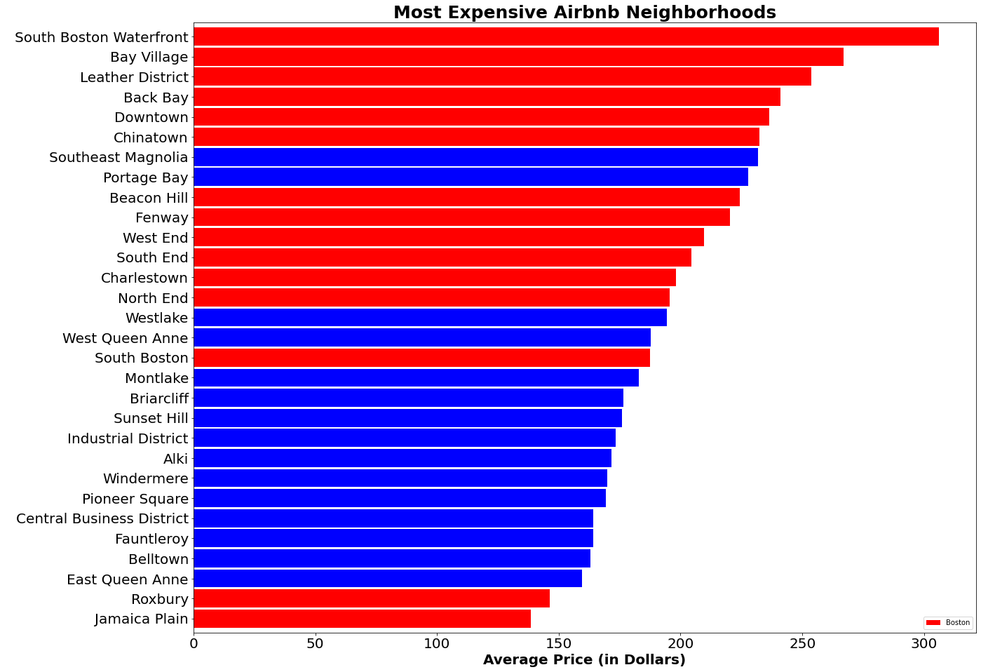
Fig. 1: A horizontal bar chart showing the 30 most expensive Airbnb neighborhoods in Boston and Seattle and what the average prices for a one night stay are. Boston dominates. I started this project by examining the 15 most expensive neighborhoods in terms of average Airbnb prices of staying one night in Boston and Seattle between 2009-2016. Like the Red Sox baseball team, the red stripes represent the Boston values, while Mariner blue stripes represent…Seattle.
14 out of the most expensive 16 neighborhoods were in Boston. And by the looks of the names of neighborhoods…finding a place on the water whether it be the Atlantic or Pacific is a little bit pricier. If it has waterfront or bay in the name, you better batter up and pay.
So what kind of reviews are the 30 most expensive Airbnb neighborhoods getting as we compare Seattle to Boston? Let’s look…

Fig. 2: Those same 30 neighborhoods from Fig. 1 but comparing the Airbnb review score averages. Seattle dominates.It looks like when it comes to reviews…Seattle has the better ratings in comparison to Boston. 11 of the 12 best reviewed expensive Airbnb neighborhoods are in Seattle! The only exception seems to be Boston’s Leather District which is in the Top 3 for both expense and reviews. Spicy…
I mean pricey, sorry. Named appropriately due to the dominance of the leather industry in the late 19th century. Fascinating.
So not only is Seattle better reviewed, it is also more reviewed…which made me wonder…well…where did Airbnb originate and when?
By the miracle of technology (or just the usefulness of Wikipedia) I was able to find out that Airbnb was started in 2008….in San Francisco. My guess is that the craze hit Seattle and got more established before it hit all the way out east in Boston.

The total number of reviews is actually 84,829 in Seattle and 68,208 in Boston.
So how different are Seattle and Boston? At the time of this data (2016) Seattle had a population of around 726,000 and Boston had 672,800. Pretty similar so far… But in terms of space the cities take up? Seattle takes up 84 square miles to Boston’s 48.3 square miles. Yikes…
So in terms of World Series…Boston’s 9 titles make it about nearly 1 World Series title per just over 5.3 square miles. That’s much better than none for all 84 square miles of Seattle. Oh well, can’t win them all!
Maybe NFL comparisons would be less of a sore subject for Seattle. I mean when have the Patriots and Seahawks ever played in the Super Bow….oh wait…Let’s just end it here!
References:
1. Title Image: https://www.yahoo.com/travel/super-bowl-smackdown-boston-vs-seattle-109371558482.html
2. Seattle/Boston info: https://www.bestplaces.net/compare-cities/seattle_wa/boston_ma/people
3. https://www.quora.com/Is-Seattle-bigger-than-Boston-Is-it-how-much-bigger
4. https://en.wikipedia.org/wiki/Airbnb